Showing posts with label Roger Reiman Mural. Show all posts

Thursday, January 22, 2015

Roger Reiman - The Walldog Event

I would guess the readers following this series of posts, are wondering what ever happened with the Roger Reiman mural project? I stepped away to go painting for a week, and a year and a half zoomed by. With all the activity in our lives, we got swept away once again!

Please forgive my delay, and allow me to finish up the posts for the Kewanee Walldog event, and more specifically, the painting of the Roger Reiman wall.

I arrived in Kewanee, IL on Saturday July 6, 2013, a bit earlier than the rest of the Walldogs. I drove down the weekend before the event started, to do some of the non-typical tasks that were required on our wall. This included assisting on the mounting of the upper name panels and the contour cut flags.

Here is a picture of the wall as I arrived. Just to give you a scale to work with, the main mural panel is 12' tall X 40' wide.


Here is the wall with the name panels mounted in place, using 3M VHB two-sided tape and heavy duty rivets.


Since most of the background was going to be based in sepia tone, I went ahead and blocked out the areas where each image was to be painted. Here we have added the contour cut flags as well.


Here I am starting my little corner of the project...


On Wednesday evening, July 10th, we started to project all the sections of the mural that still needed to be sketched out. The city of Kewanee was able to turn the street lights down for us on Wednesday evening, which makes our task a bit easier.


We had a great group of painters who joined in to make this such a successful project. First off, is our dear friend Bill Riedel. Bill came all the way out from Little Ferry, NJ, to join us in the hot summer sun to add his amazing talents to our wall. Bill painted several of the portraits you will see on the final mural, As well as good portions of some of the other image sections. Here he is working on Evel Knievel's portraits.


We also had Ted Turner from up Milwaukee way, handling as many tasks as he could. Ted painted the far left flat track racing machine, as well as helping me paint the streamliner one evening, at about 10pm. Ted also joined in with Bill to paint the numerous bikes on the upper right corner of the main panel.


Dustin Hobert was also on board to work his magic with the airbrush. Dustin painted the large portrait of Roger, as well as a panel with Roger and his Mother. 


And on the center section, we had George Sedlak, and Lili Payne working on the Evel and Roger section. George is the owner of Sedlak Studio, and is the artist who painted many of Evel's helmets and motorcycles back in the early 70's.


Well, it seems this post is running a little long, so I think I will post the completed mural images on my next post. Hopefully it will not take another year to get the final chapter of this project out there!


Friday, July 5, 2013

Roger Reiman - Final Preparation

Up-Front Work

In the last post of the design series, I mentioned that we needed to paint the name panels with automotive  base coat/ clear coat. On June 28 - 30 we drove down to Kewanee, IL to do the name panel painting. My co-leader Ted Turner and I worked from 9am Saturday morning until 3am Sunday morning to accomplish this task!

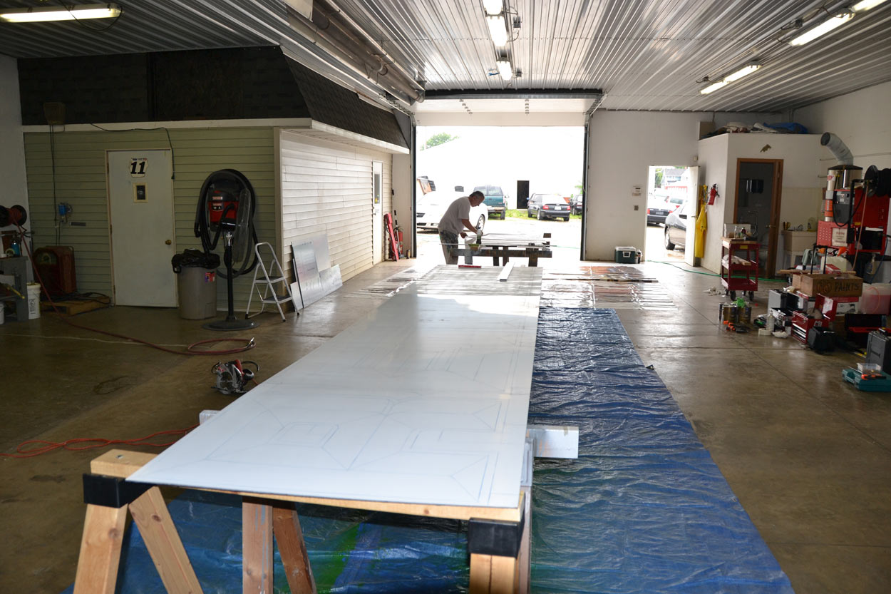
28 feet of contour cut name panels are now painted in four color convex prismatic lettering. Here is a picture of the layout process for that stage of the project.


Maquette


Each year, the Walldog project leaders are asked to produce a maquette of their mural design, which is then sold at a charity auction during the event. In the initial stages of this project, I was hoping to do a hand drawn presentation of our design. As things progressed, and the reality of time management set in, I changed the maquette to a digitally printed piece. I ended up doing a scaled presentation with contour cut raised artwork. The piece below is mounted in an aluminum frame and the protective plastic cover is still on the plexi-glass. The overall size is 24" tall by 44" wide.


I also did a small oil painting to donate, just to see if I remember how to paint. This painting is 18" x 24" oil on canvas. It is of Roger at a flat track race, when he was riding with the National Champion number 1 on his bike.


Equipment


Since we had to do the additional step of painting base coat/clear coat, additional equipment was required. I have a set of spray guns which I only use for automotive paint. I have a separate set of spray guns that I use with Nova Colors Artist Acrylic paint. 

We are also doing some of the installation of name panels, contour cut flags and the aluminum support frames that hold them all up. So we also need to pack the additional equipment that is required for all of those processes. 

Then there is the "normal" mural gear that we usually bring to an event. Brushes, projectors, projector stands, lights, straight edges, camera gear, and on it goes. 

If you are interested in learning more about the specific types of equipment we use, drop me a note in the comment section, and I'll get back to you.

Needless to say, We have a ton of equipment being loaded up for the Roger Reiman Mural  project.


Reference Images


Once the images are traced onto the walls, and we are ready to start painting, we need to have printed reference images, to hand off to each artist who is helping on the wall. A high-resolution image mounted on a fairly rigid stock will work out well. Here are a few of the images I have produced for our project. 


See you there


Well, tomorrow morning is the day we load up and head to Kewanee, IL for the 20th year of Walldog mural painting and our very special project. We have put in a solid year of planning and work to get to this point. It's time to go painting. Wish us well, and we hope to see you all there.


Thursday, June 20, 2013

Roger Reiman - Design - Part 6

The Extra Mile


When I was first introduced to the Roger Reiman Mural project, I was very intrigued. As we did more and more research, I knew that we had to create an extra special mural. It has been my goal all along, to create a rich expression of the legacy that Roger left behind.

In part, we did this by including the bold images that have been selected for the main panel. But there was additional space available to add a few extra elements. The building that was selected for this mural has a bit of an "L" shape to it, which needed to be filled up. 

As I mentioned in an earlier post, the wall isn't in solid enough shape to paint directly onto it's surface. So, if we wanted to add something above the main mural section, it would also have to be made on a panel. The simple approach would be to just put another rectangular panel above the main panel. Not sure I understand the simple approach? 

This is where the crazy sets in. 

In the early part of most any project, there is that time when you just brainstorm ideas. Things pop into your mind and you jot them down. Usually you end up with a laundry list of cool ideas, but not all of them make it through the entire design process. 

In the early stages of this project, I created my list of ideas for the Roger Reiman mural. Let's take a look at how that worked out.

Contour Cut Name Panels


From the very start, I had an idea that I wanted to contour cut the Roger Reiman name panels and install them above the main panel. Sounds easy enough. But what if they were tilted towards the viewer at a 5 degree angle? That would be cool, but how would that be done?

The panels for the entire Kewanee Walldog project are being built by a very generous donor. Perhaps if I contacted them, they would be willing to build these panels. As it turns out, they said to send over some drawings and they would see what they could do.

To make a very long story short, here are a few drawings...


And to make it even more interesting..."what if we were to paint these with Automotive base coat/clear coat and install them before the main event". The mounting frames are built and the panels sections are cut to size. The paint has been purchased, and plans are being made to pull this effort together.

Contour Cut Flags


What would contour cut name panels be without a few unique shaped, contour cut, Daytona 200 winner flags? In a previous post, I covered how the flag artwork was created. I then used that artwork to create full-scale patterns for the contour cut flags.

I cut Aluminum Composite Panels to the desired shape, then masked off the checkered areas. Followed that up with the lettering and AMA logos. Off course, the shadows and highlights had to be airbrushed to make them look more realistic. The final step was to apply automotive clear coat.


The flags also needed a mounting structure. Since each flag was a unique shape, They each needed their own unique mounting structure. Once again, dimensioned drawings were sent to the donor who was doing the fabrication. Each flag will be securely mounted to a 1 1/2" X 1 1/2 welded aluminum frame.


Side Panel


Somewhere along the trail, we decided to add a Side Panel with a list of Roger's accomplishments. You guessed it, couldn't do this the easy way either. I decided to include another frame supported ACP section just to the right of the main panel.

Here is an image of the "sketch" I produced.


This panel was base coat painted with light sepia tone pearl paint, which has a slight blue tint. I then painted the border black and added an 1/8" fire red pinstripe. Once again, this panel was clear coated with automotive paint before being sent off for lettering. 

For the lettering task, I sought the best hand lettering artist I know...Bob Behounek from Chicago, IL. The smaller image panel at the top is off being airbrushed by Dustin Hobert, one of the best airbrush artists in the business! That small panel will also be clear coated, then attached to the larger section.

The side panel will be mounted to it's own custom built aluminum frame structure, using a combination of 3M VHB tape, and rivets.

Gold Leaf 


Since Evel Knievel's jump bikes and helmets were often done using engine turned gold leaf, I thought it would be cool to add that element to the mural. The decision was made to to do a 2 1/4 inch border of satin black Dibond (ACP) with an inset 1/2" of engine turned gold leaf. Of course, the gold would need to have a fire red outline applied in order to match the other panels and colors used on the main mural. 

The material is cut and prepped and plans are being put together to add this element to the border of the main panel section. That is a total of 105' of 1/2" gold stripe!


Frame the Art


Most generally, there is no edge trim applied to the panels at a Walldog event. But "what if we wrapped the edge with black satin anodized aluminum angle stock"? The plan is to add the gold leaf border sections and then apply the black angle aluminum sections over the gold leaf trim pieces. This will put a nice finishing edge or frame around the main section of the mural. 

Alright, that is enough crazy ideas for one evening. Next up we need to start planning on how to get all the required equipment to the mural site. But first, there is other prep work that needs to be done. More on that in the next post.....take care for now.


Wednesday, June 12, 2013

Roger Reiman - Design - Part 5

Final Design


I believe it is time to put the final touches on the Roger Reiman mural concept and send it off for review. 

I have outlined several of the decisions that have driven our design up to this point. I will complete this design series by talking about some of the design directions that influenced our final concept. In the last post of this series, I included a thumbnail of the original sketch I did, using full color images across the entire main portion of the mural. I will post it again for reference.


Upon looking more closely at this concept we decided there was just too much going on visually with all the images in color.  We made a few decisions in order to simplify the visual look and shift the focus of the viewers attention to the main elements of the design. 

Originally, we were going to include script style phrases that highlighted major points in Roger's life. We decided to move those phrases onto a separate side panel, that will be mounted to the right of the main panel. We also decided to move the image of Roger's Father flying off his bike, onto the top of the side panel. We decided to switch the far left image of Roger to a different flat track photo, that seemed to fill the space better. 

The final major change, was to shift the color of all of the image backgrounds to sepia tone. This decisions was based on several factors. The main factor would be that it simplifies the overall design. By changing all the backgrounds to the same color pallet and leaving the main image in color, the focus then shifts to the images of Roger and Evel and off all the busyness of the background colors. 

A side benefit to this change, will be that the entire background will be much easier to paint. Considering that the event only last for 4 days, we can now paint in the background more quickly, which leaves more time to focus on the most important elements of the design. 

So, here is the final design with all the changes discussed above.


Saturday, May 11, 2013

Roger Reiman - Design - Part 4


Font Choices


In this post, I would like to explain the process I go through to choose the appropriate font for my design projects. There are literally thousands of different fonts available for design software programs. Like any topic, there are many different approaches to picking what works best for your project. I would like to outline my approach here and let you decide if it works for you or not.

I started doing logo design several years before the computer was used for the task. I learned to design my own lettering by looking through a Letraset catalog, picking a font, and then drawing them out by hand in non-repro blue pencil. From there the art and lettering was inked by hand and turned into black and white camera ready art using a vertical process camera. It was fairly tedious, but it also allowed me to create very original designs.

At that time, I worked for a specialty advertising firm that sold a lot of screen printed garments. I created logos and T-shirt designs for everything from bank presidents to bikers. I learned very quickly that picking a font for a bank is much different than picking a font for a road house! 


Each font has it's own character and can make a certain impression on the viewer. Recently, a PowerPoint presentation was given that used the font Comic San to outline the discovery of Higgs Boson. Comic Sans might be appropriate for a day care center (maybe) but not if you want to be taken seriously. When asked why they picked that font to present the discovery, the CERN presenter said..."because I like it." Just a bit of a tip, this approach is problematic, because it places too much importance on individuality. A decision based solely on personal choice does not involve the thought process required to make appropriate and successful design decisions.

Narrowing the Search


The heading above makes me chuckle a bit when I think about the process I am about to explain! I have just over 2400 individual fonts on my computer. I have a font viewer program that allows me to go through each font and see the word(s) I am trying to set in each font. I also use the website www.fontshop.com to browse their font library. Fontshop.com has the same feature that allows me to see all their fonts in whatever word(s) I am looking to set. Fontshop.com has 3,387 families of fonts which total 12,929 individual items, in the display font category alone.

So, I usually search though both my computer's font viewer program and Fontshop.com's library of fonts to find the best solution for the design I am working on. That equates to scrolling trough about 15,000 fonts. You might ask yourself, what exactly am I looking for? Well, I am looking to fill certain parameters specific to each design or element of a design.

For instance, I wanted the Roger Reiman name used on our mural to be very bold and easy to read while approaching at 25 m.p.h. in a vehicle. It will most likely be the first element of the mural that will catch the viewers attention. I didn't want the font to be identified with a particular period of time. Even though Roger Reiman is remembered for his many accomplishments in the 1960's, his career spanned up through the 1990's. 

Early in the mural design process, I kept picturing the type of lettering I remember seeing on high-performance automotive parts packaging. I also looked at motorcycle racing posters from the 1960's to the present day. But I kept going back to things like, NGK spark plug packages, GT-1 Racing Motor Oil, etc.

With all this in mind, I start working through my 15,000 font search. When I see a font that fulfills the parameters, I write down it's name or do a screen capture, and save them all in a folder.


I then assemble as many of the individual fonts into an Adobe® Illustrator® letter sized page that I can. I can now save this page as a PDF so it is ready to send to client if needed. I try to narrow the initial search to four or five pages of lettering samples. In this format it easy to see that only about half of the fonts chosen will actually be something to consider moving forward with. Here is one of the pages I put together for the main name panels during the exploration. 


I picked a couple of fonts from these pages and played around with some blending option in PhotoShop®.


I ended up choosing a font that I had in my system called Race 1 Eternals Chiseled Normal. The image below shows the original font and the steps or layers that had to be added to achieve four color chiseled look lettering. I knew I was going to eventually need all the colors on their own layer, so I took the time to vectorize each color or layer needed.   


Here are both names set in the selected font, with all the layers and color effects applied.


Script Font


In the original sketch that I created, I thought I would use a script style font for the secondary type.


On the first draft of the design, I added several phrases that express major highlights from Roger's life. As the design evolved, I was able to reduce the number of phrases on the mural by introducing them in other elements. The 3-time Daytona Winner phrase will now be expressed in the painted flags above the name panels. I explained the flags in more detail in Part 3 of this Design series of posts.

Initially, I choose a hand-lettered style of script because it has been used on many types of race vehicles for several decades. The forward slant and flow of script expresses the feeling of speed and movement. Once again, I went through the process of reviewing several thousand different script style fonts.


The script used in the mural sketch above is called Sarah Script and it was designed by Charles Borges. 

In the end, we decided to design a totally original hand-drawn set of phrases. Ted Turner, the project co-leader, is in the final stages of rendering the new phrases.

Just a bit about the colors we are working with for the lettering. We were thinking of introducing some kind of gold leaf element to the mural design. George Sedlak was known for adding various styles of gold leaf lettering to Evel Knievel's helmets, and motorcycle paint jobs, so we decided to add gold somewhere. 

The name panels are to be painted with base coat/clear coat automotive paint. We intend to use metallic base colors which will hopefully give a finished color that resemble and match the gold leaf. The script lettering will use some of the colors pulled from the main images. Most likely warm white, orange, and black.

In the next installment, we will talk about some of the final design decisions and perhaps unveil the final Roger Reiman Mural Design Concept.   

Sunday, April 28, 2013

Roger Reiman - Design - Part 3

The Flags


Somewhere in the design process, we decided to incorporate the three unique flags that Roger Reiman won at Daytona. In order to use the flags as pieces of our design, they needed to be converted to a digital format that could be scaled, then dropped into the main panel renderings. 

As I mentioned before, I work mostly using the Adobe® Creative Suite® of software. More specifically, I use Adobe® Illustrator® to create vector files and Adobe® PhotoShop® to create and manipulate raster or bitmap images. Perhaps it would be good to provide a description of the two different file types here, for those not familiar with the terminology.


Vector Graphics File - Adobe® Illustrator®

A vector graphic uses geometric primitives such as points, lines, curves, and shapes or polygons, to represent images in computer graphics. More generally, it is a graphic made up of fills and outlines that will retain smooth geometry when scaled to any size. (see vector image below)


Raster Graphics File - Adobe® Photoshop®

In computer graphics, a raster graphic, or bitmap, is a dot matrix data structure representing a generally rectangle grid of pixels, or points of color. More generally, a graphic or photographic image made up of colored dots. When you scale a raster image, the dots get larger, creating a sawtooth image. (see enlarged raster image below)
   

File Format Use

We need to keep in mind, how the final draft of the design will end up being used. If we intend to use a plotter to contour cut patterns or masks, we will need to create vector based files. If we only need to print the final design, we could use a raster or bitmap image file.

About the Flags

The only reference images of the flags that we had to work with, were the photos that we took of them at the Reiman Harley-Davidson Dealership. The flags are framed behind glass, so we had various reflections to work around. Below is one of those images.

 
In order to create a vector of the flag, I had to isolate each element so that I could open them in Illustrator®. I copied and pasted each element into a new PhotoShop® document.


I then deleted all the background that wasn't needed, and saved the files in the PNG format, which retains the transparent background.


In order to recreate the lettering used on the flags, I found the closest font that I could, and modified it to suit my needs. I opened the raster image created in PhotoShop®, and put it on the lowest layer. I then added a new layer over the original lettering which contained an outlined version of the "close enough" font. I used the transparency tool when I needed to see the original reference layer.


I basically did the same thing with the AMA Logo which will be used on all three flags. Note the split line in the image below.


For the black and white portions of the flag, I took a measurement of the actual black and white squares, and used that dimension to create a scaled version of the flag. By using the exact size, I was able to scale the lettering to the same points as on the original flags.


Above is the vector image of the 1965 Daytona 200 flag. Below is the vector file of the flag in the outline view mode in Illustrator®. Each element on the artwork is an outline that can be filled and or outlined with any color, then scaled to any size. This is the type of file required to do any contour cuts on plotter/cutter type equipment.


From here, I wanted to make the flags look like they were waving in the air, and give them some dimension. I started that process by applying a warp filter in Illustrator®.


I then saved the file in the PNG format, which produces an image only were there is color present, and the rest of the background remains transparent. 

I opened the saved PNG file in PhotoShop® and applied warp, puppet warp, and displace filters to produce the 3D flag effects. The small grey square pattern that appears in the image below, is PhotoShop's method of depicting a transparent background.


Rinse and repeat for all three flag designs.


In the next post, I hope to start putting all the elements of the design together.